Yesterday, I experimented with a couple of other grid textures. In approaching this, I wanted there to be a standard unit in the size of the grid (i.e. the size of the grid would be a multiple of the length of the cube).
This is because the grid exists primarily to help the player gauge distance for puzzles, and if the lines weren’t following a standard unit, it wouldn’t be very helpful.
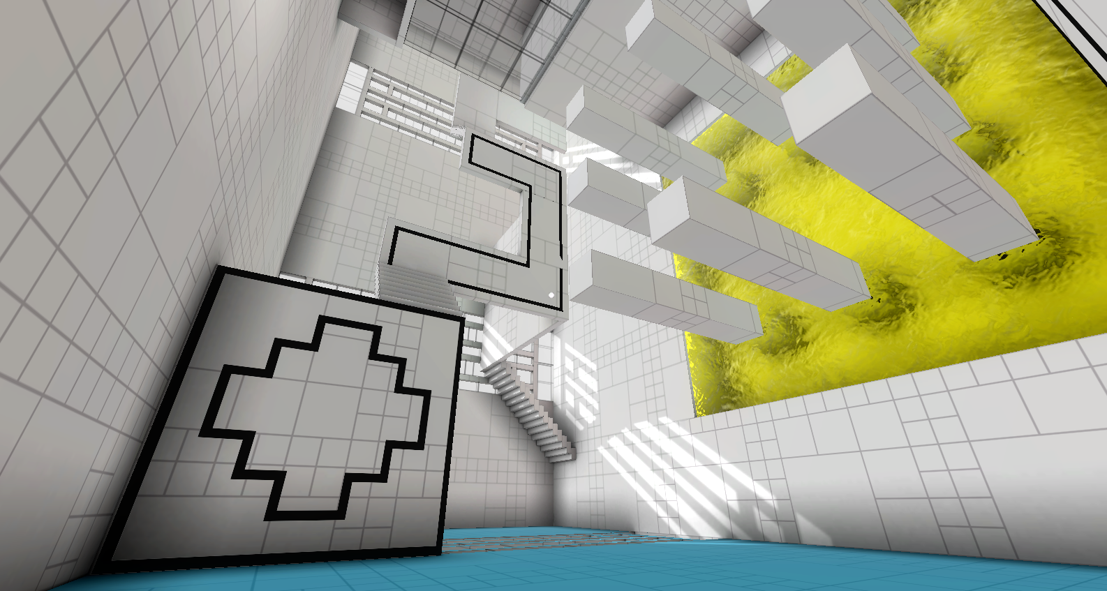
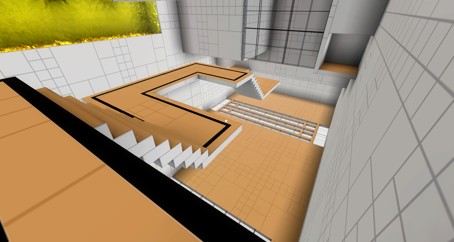
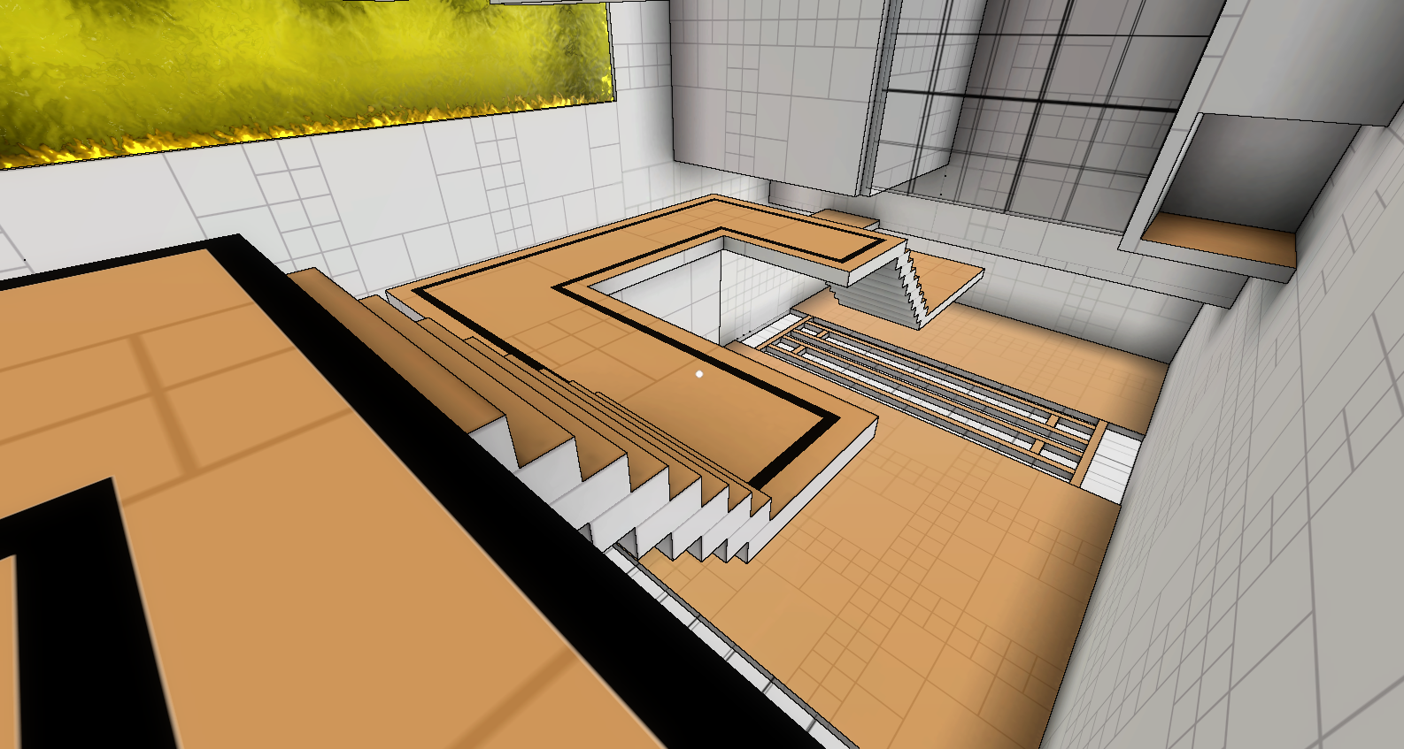
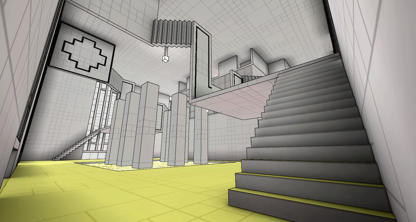
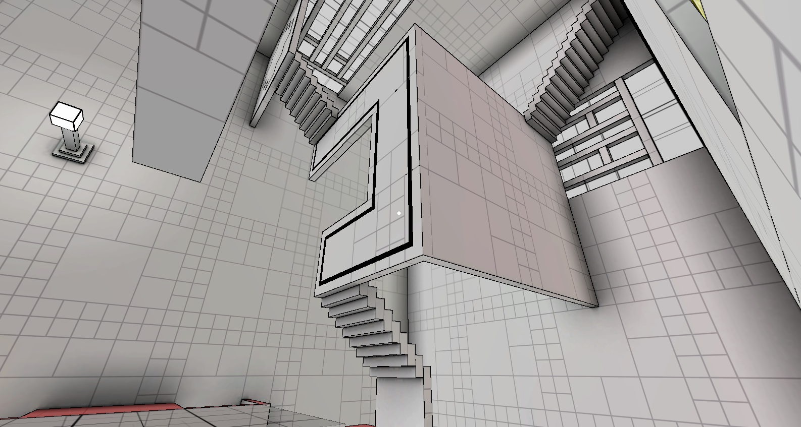
I didn’t want to get too carried away at this point, so just tried varying the size of grid boxes. This already made a huge difference to the look. I also tried narrowing the lines and lightening the color. I figured that the grid doesn’t need to be very dominating, especially if I already have ambient occlusion defining the volume. It just needs to be visible enough that the player can see it when they need to.

I also took Juan Raigada’s suggestion and made the ambient occlusion (AO) radius larger. At first, I set the radisu to 5, but it made everything too dark, as I had the contrast set at 1.8. So I played around with the values a bit, and eventually found a sweet spot of AO radius at 3, and contrast at 1.
I also raised the ambient light a bit, and increased the intensity of the directional light. It made a huge difference! So much so, in fact, that the AO alone seems to define the geometry quite well without any edge-detection.
Anyway, I took a couple more comparison screenshots between having edge-detetction on vs off. To be fair, I’m still using the default Unity edge-detection shader, which, as previously discussed, is not sufficient for my purposes. So these shots are not meant to be for making final judgement calls.
In any case, they look pretty cool, and I definitely feel like I’m getting closer to finding the appropriate art style for Relativity.


One Comment
Hello!
Very interesting effect edge detect.
Can you publish image(map) of nodes for shader forge?
Big thanks! 😉