Mostly been working on the redesign of the starting level of Relativity. This time around, I was able to approach the scene with the experience of having designed several other levels, and also having settled on various architectural elements that fit well with the game’s overall art direction.
I paid more attention to how the space is divided, as well as the the flow of player movement in going from one area to another. Basically, I wanted to maximize the function of each area in providing player with knowledge whilst minimizing any possible confusion. Of course, at this point, all of my theories are speculative, and only playtesting will tell whether the level is effective or not.
I’ve also made two additional improvements to the visuals:
- I’m quite happy with the new look of the windows. I made the grid a little bigger, and also changed the color of the lines from white to black. This has a little more contrast with the opaque walls.
- I’ve added an additional ring band around the interior of the door frame. It looks weird and unfinished when the decal line just ends right before the door, and this new look feels more complete. Compare the two images below:

They are two different kinds of doors, and that’s why the patterns of the decals are different. But you can see that when the line ends right before the door, it looks a bit awkward. Note that in both images the doors themselves are open and hidden inside the door frame.
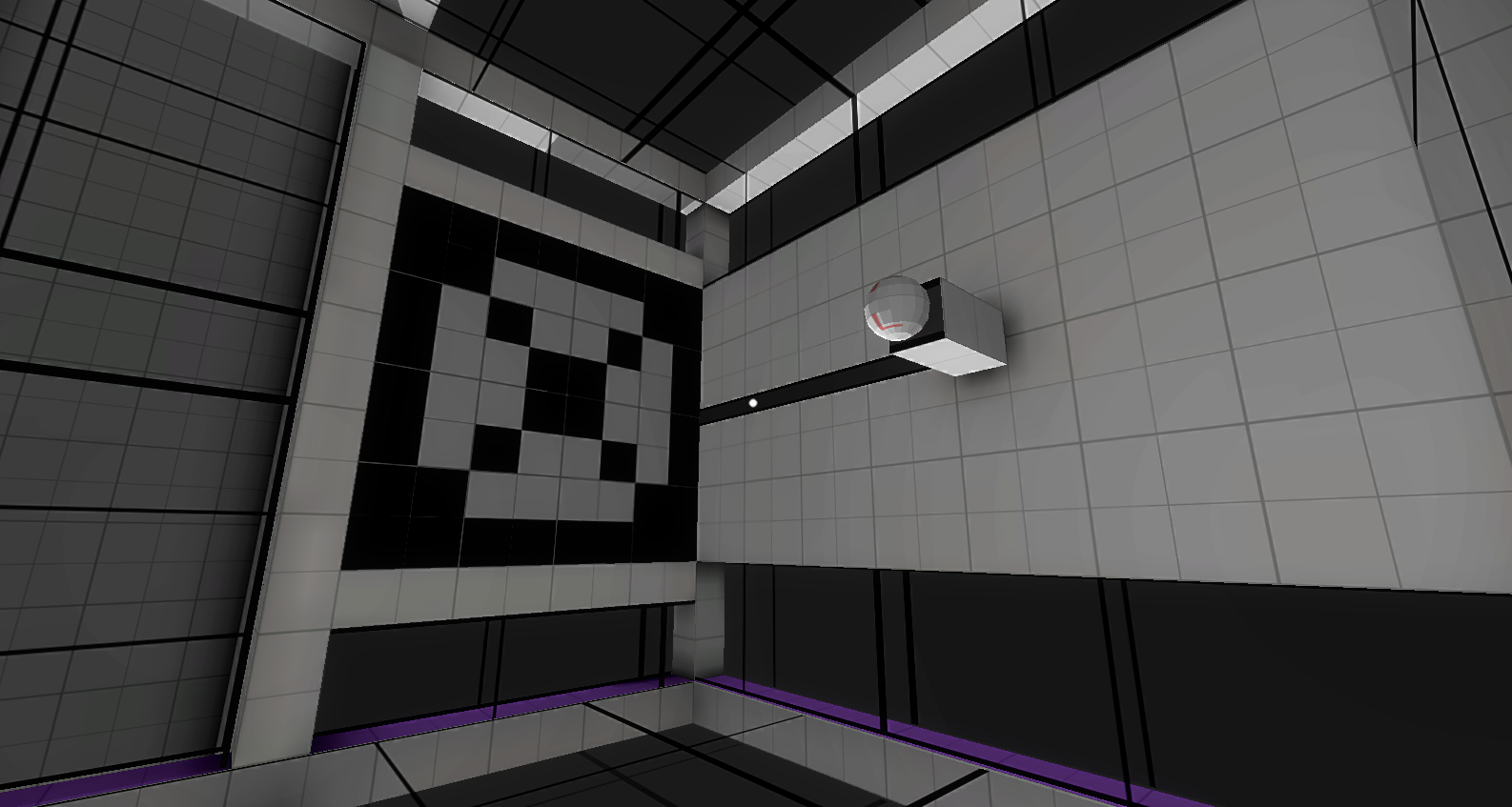
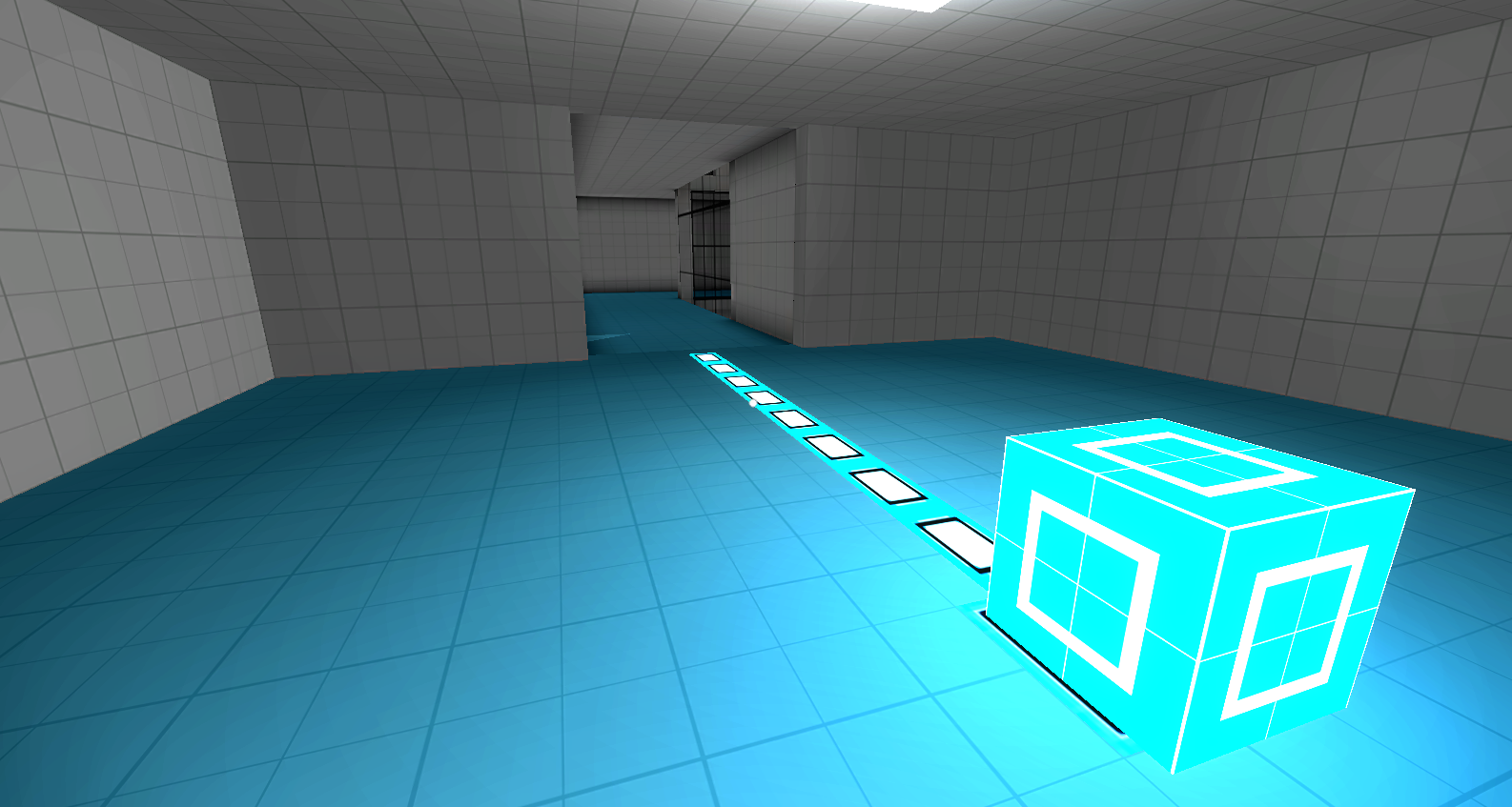
And here are a few other screenshots: