I’ve had an idea for poster I wanted to try out for quite some time now. Yesterday, I was feeling a little stuck on a particular puzzle I was working on, so I decided to take a break and give the poster idea a go.
The core of the idea was to have 6 vertical panels across a horizontal image, each panel showing a scene with a different gravity field.
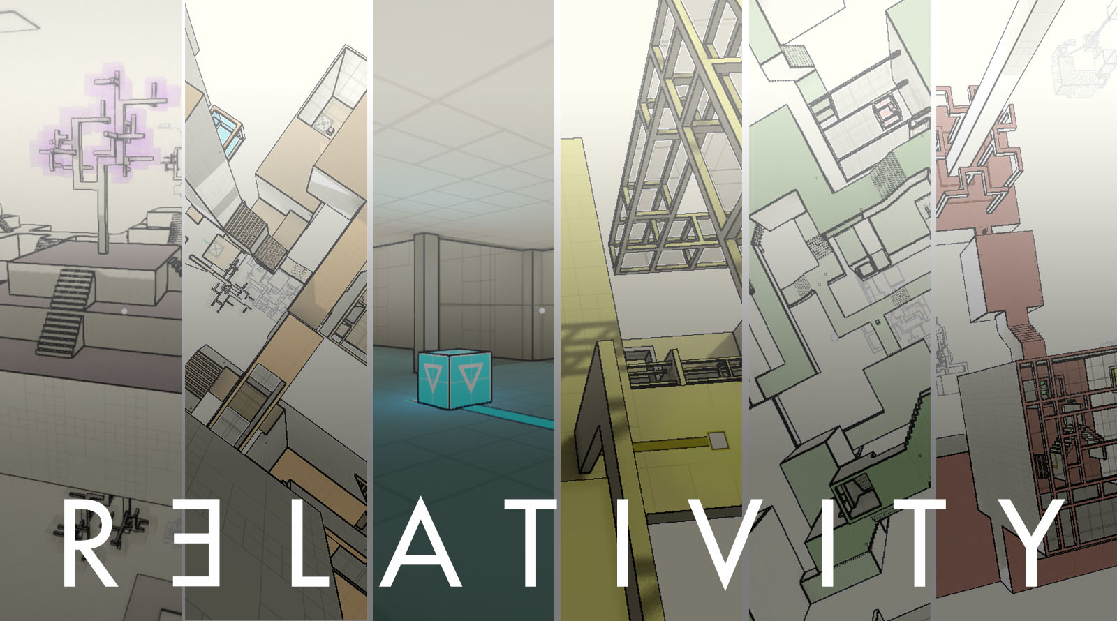
This was the first version I drew up:

It’s kind of cool, but I need to put the title of the game somewhere…

The problem here is that you can barely read the text.
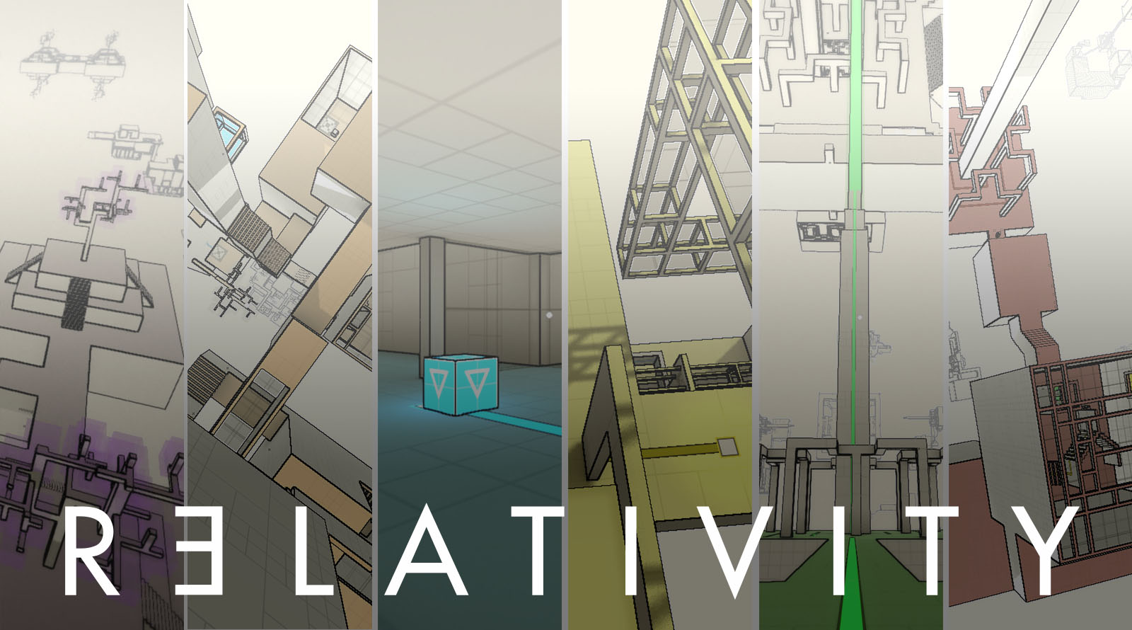
I decided to add a gradient layer, like this, just below the title, but above the image panels:

And then turned the opacity of that layer down to about 40%:
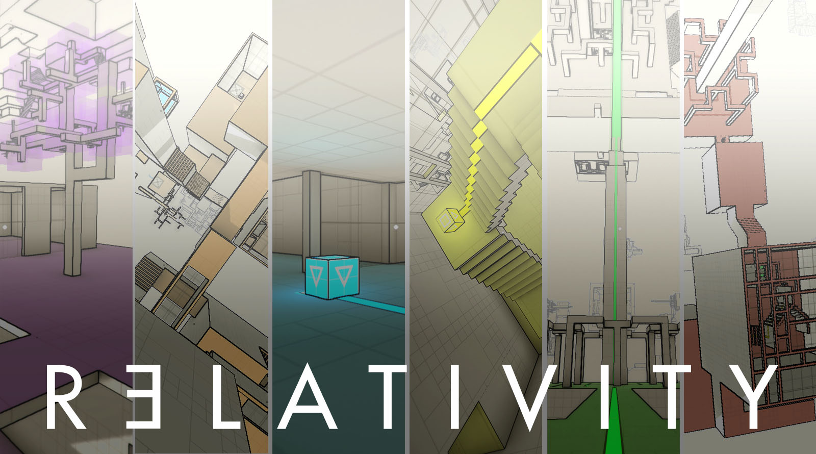
That’s looking a lot better. However, problem here is that the purple panel on the very left isn’t a very striking image, and the orange (2) and green (5) panels look way to similar. I think blue works well as it’s the only interior scene, so it stands out a lot, and it’s also quite minimalist.
Here’s version number 2:
I think it could use another indoor scene to balance it out a bit. So here’s the final version, at least for now:
Of course, I’m still quite a bit ways away from release, so this is by no means the definitive poster for the game. Just like with all the levels and puzzles in the game, I’m going to keep iterating on this until I get it right. I’m starting to do so now, so that I can give myself as much time as possible, and to get all the bad ideas out of the way.