Visual Style
One of the primary challenges I’ve had to deal with throughout development has been finding a unique visual style for the game. I don’t think I’ve found the right look just yet, and I’m still iterating on a regular basis. However, the game’s visual style has come quite a long way from when I first started working on the game, so I thought I’d take a moment to write up a post sharing my thought process up until now, and what my plan moving forward is.
November 2012
I wrote the very first prototype of the game over the course of Thanksgiving weekend back in 2012. Back then, the core mechanic was that you could change the orientation of the room, while the player’s orientation stayed the same (the mechanic now is that the player orientation changes, but environment stays the same).
I was very new to Unity and game development in general at that time. I was going for a pseudo science fiction look at the time, but there was no purposeful art direction. I was still learning to work with materials, so was just placing random textures on everything. I remember spending several hours trying to find the perfect wood texture for the floor, which in hindsight, was really not a good use of my time. The lighting was also just point lights placed around the scene without too much thought. It’s very clear this is made by someone who has no idea what they’re doing.
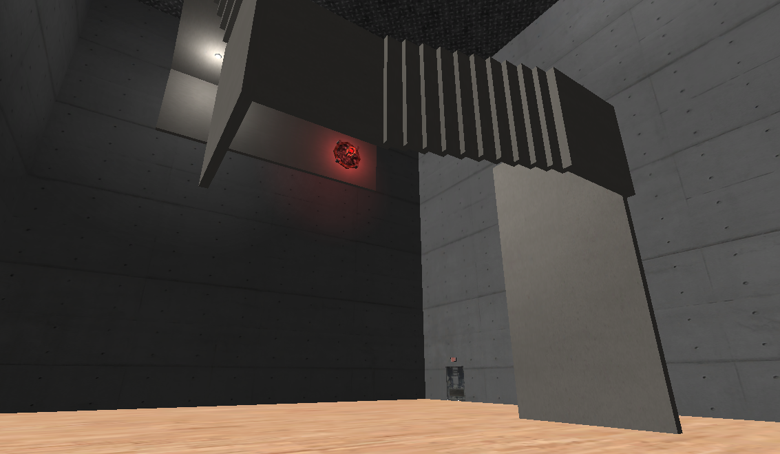

March 2013
I continued working on the same version of the game for about 4 months, adding new mechanics, and cleaning up the look. You can see in the first picture that there’s an electric field, a button on the ceiling, and also some more variation in textures. However, there still isn’t a very clear art direction, and no cohesive tone. Everything in the scene looks like it came from a completely different place (because they did). Most of the textures and assets were drawn from various free sci-fi asset packages. The door came from one, the wall decal came from another.
The art style at this point is still very inconsistent, and without any purpose. There was no reason why the boxes have wood panel textures while the other blocks have a green metallic metal. However, you can see that I was starting to use color to signal puzzle elements – for example, the red button was meant to indicate that it was associated with the red door.
April 2013
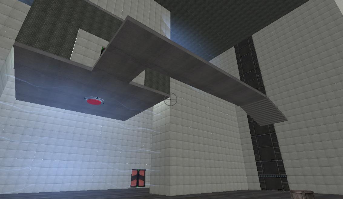
Around the end of March, I finally did a real playtest session, and realized that the core mechanic just wasn’t working. As painful as it was, I decided I needed to start from scratch again. On a side note, this really taught me the importance of playtesting early and often. Instead of focusing on aesthetics and wasting time choosing textures, I chose to focus on getting the mechanics and the puzzles right. Instead of having the room rotate, I found that it was much more interesting when the player rotated, and that objects were locked to the player’s orientation.
You can see in the top left corner of the screenshots that I was reading the normal values of different surfaces as well as tracking the player’s orientation.
This is the very beginning of a much more minimalist look. I decided that anything I would add into the game at this point would be purely functional. Colored objects are ones that the player can interact with, and white objects are not. Different colors are used to indicate objects in different gravity fields.


October 2013
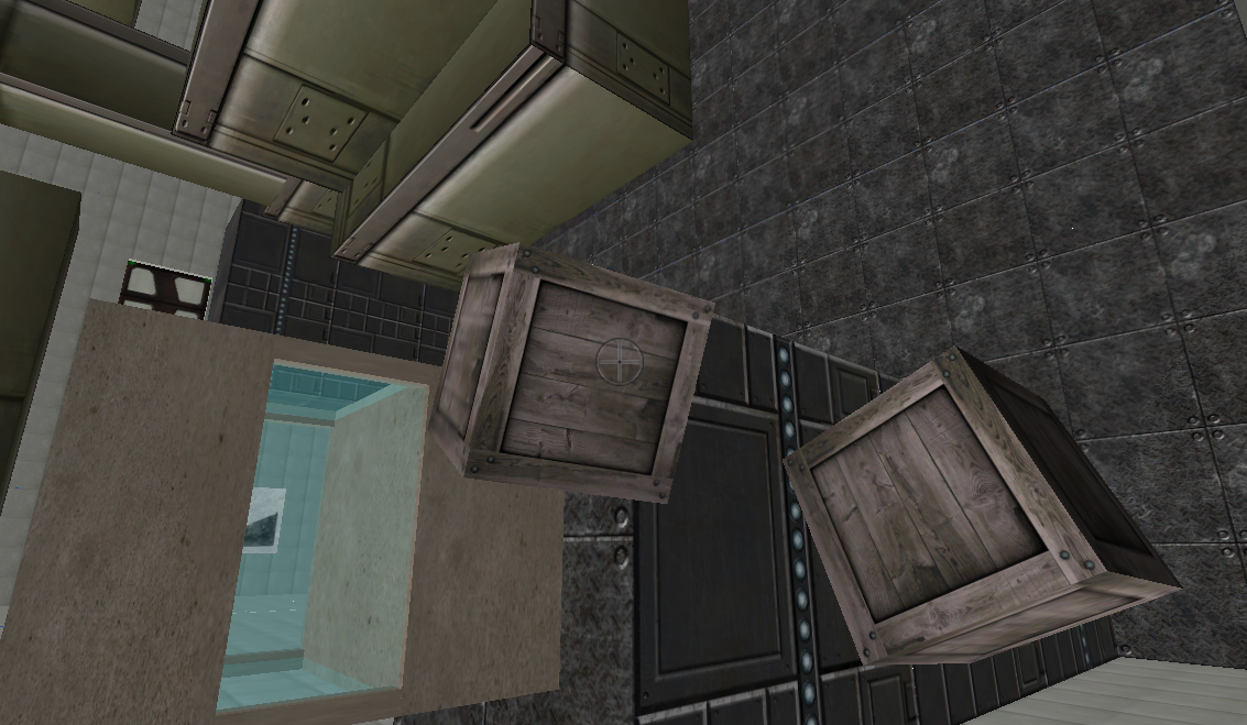
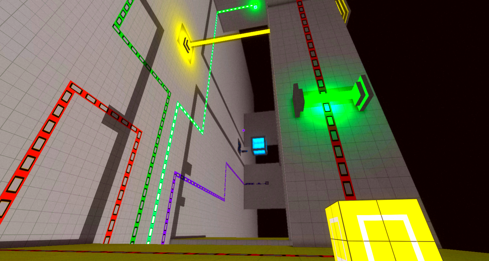
Over the next six months, I continued to develop the mechanic. During this time, I continued to refine the look, bit by bit, but it still wasn’t the priority. All the visual elements were added to address specific design problems I saw when doing playtest sessions.
Here’s a few of the changes that affected the aesthetics:
- Replaced buttons with squares on the floor so that you couldn’t place just any cube on it, but only ones of a specific color.
- Added color to whatever floor is ‘down’ to help players orient themselves
- Instead of turning white, boxes that are in a different field turn to a faded color version of themselves, so players can know which gravity field boxes belong to regardless of which orientation they’re currently in.
- Added decals from switches to doors to make the connection clear.
During this time, I started to share some images on Twitter through Screenshot Saturday, and a lot of the response was that while the mechanic looked interested, the art style itself looked too generic.
A screenshot I shared was included in Indie Statik’s Screenshot Scrutiny, and this is what the article said:
Despite Relativity’s looking like a bunch of other first-person puzzle games due to its focus on colored cubes, square rooms and predominantly grey/white palette, it’s interesting enough to garner my attention.
So yeah, the game looked too generic. Just about every other FPS puzzle game is indoors with white walls and colored cubes. I knew I would have to do something about this, but really didn’t know how I would address the problem. White walls and colored cubes are popular, precisely because they really help make the puzzle elements stand out. Plus, as a solo developer, I have very little knowledge of 3D modeling. I’m much more comfortable programming and design, and knew that I wouldn’t be able to beautify the game with fancy models or textures.
There were also lots of comparisons to Portal, which is somewhat inevitable with any FPS puzzle game, but especially because of the place-box-on-switch-to-open-door element of the puzzles.


December 2013
After introducing the “cube dispenser”, which releases cubes while destroying previous ones, I started to have exterior spaces in the game. Prior to this, everything happened indoors. Without these dispensers, a player could drop a box off the edge when outside and be stuck in the puzzle without the necessary tools.
I realized the exterior scenes were actually extremely strong visually, as they really allowed the game’s crazy geometry to shine.
You can see that I’m also starting to experiment with more interesting architecture. Sometimes I would spend up to a week trying to make a small village, with a number of different buildings, each with an imagined purpose. There were apartments, libraries, etc. I was also starting to play with lighting and trying to use that to create a mood. Most of these experiments ended up not getting used in the game (at least in the current version), but really helped me figure out what worked visually, and what didn’t. The biggest challenge was trying to balance the visuals with playability. Often, architecture that was disorganized and all over the place provided very cool-looking visuals, but were very difficult to navigate. Finding out how worked and what didn’t, was a constant process of trial and error.

March 2014
I changed the sky color to white, as it looked very strange for there to be shadows when the sky was black.
During this month, I went to GDC for the first time, and showed the game to several developers. Pretty much almost everyone’s feedback was: interesting mechanic, great puzzles, but looks far too generic.


April 2014
After GDC, I knew I really had to work on the art style. My goal when I first started on the new version of the mechanic was to get the mechanic and puzzles right first before moving onto aesthetics. And while there were some issues with the puzzle and the mechanics, they were far enough along that one got a clear sense of what it was about.
At this point, I knew the core mechanics and puzzles were good and promising, because when people played the game for a bit, they would get really excited. However, I was having trouble getting people’s attention based on the art style alone. I was also starting to experiment with marketing at this point, knowing that I should start as early as possible, so a unique look would be very important.
Since fancy 3D modeling and textures weren’t going to be option, I knew that my best bet would be using shaders. As a programmer, a postprocessing shader meant that I could keep the existing geometry in the game, and working with code was a lot more comfortable for me than pulling up Photoshop. I hadn’t really worked with shaders much before, but decided that taking a week off to really dive into the subject would be a worthwhile use of my time.
I ended up deconstructing the default Unity edge-detction shader, and creating my own. After I posted some screenshots with the new look, the response was very positive. I started to get comments about the art style alone.


June 2014
I started to think more about the sky. Having it completely blank felt lacking in the visuals, and also made it slightly more difficult to orient oneself. The problem is, because of the core mechanic, there aren’t any areas that are out of the player’s reach. I can’t have a location be “too high”, because the player can simply change gravity, and now that location would be below them, and they can just fall down on top of it. I also didn’t want to resort to placing invisible walls all over the place to restrict player movement.
Eventually, I came up with the solution of having the world be 3D screenwrapped, so that you see repetitions of the same world in the distance. This way, it allows me to have stuff in the sky so it’s not completely blank, but also allows the player to land on anything they can see. The rule of being able to go to everywhere you see therefore remains consistent.
It also improves the visuals quite a bit, and makes it much more interesting.
I also started to play around with layering effects, such as adding a bit of vignetting to make the look more dreamy, and also tweaked the edge-detection shader.


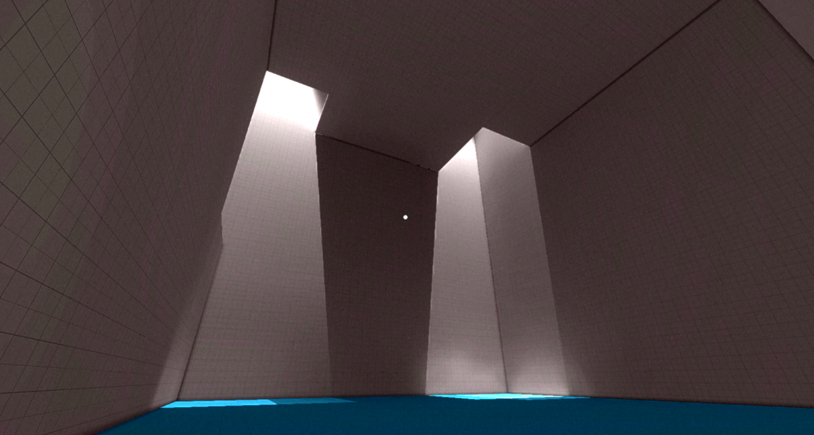
Present
The look has come a long way, and looks completely different from the first version of the game.
The problem now is that it looks too much like Antichamber. While there are a lot of differences in the art style between the two games, at a cursory glance, it can be easy to mistake, especially given how quick consumers are to make judgements. Everytime I post on a screenshot on reddit, either on /r/indiegaming or /r/gamedev, comparisons to Antichamber would come up.
Last week, I decided to sit down and really analyze the differences in visuals between Relativity and Antichamber, and what I can do to further differentiate my game visually.
For comparison, here are several screenshots from Antichamber:


From looking at these screenshots, these are some of the elements that make up the visual style of Antichamber:
- edge-detction
- white walls
- colored cubes
- Expanses of color
- Sharp corners
- 98% of the game is indoors
- no shadows
So what is making my current art style look similar? I would say:
- edge-detection
- sharp corners
- minimal use of colors
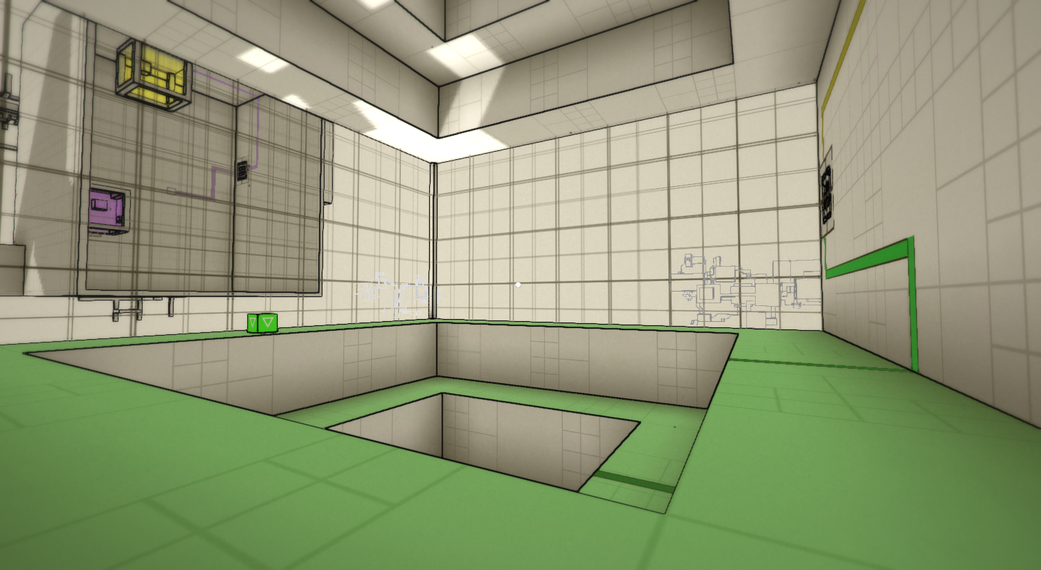
I consider these elements that I cannot change. The edge-detection really helps visually to distinguish different objects, and makes the game look not as grey-box-ey. The sharp corners have to be there, because the core mechanic doesn’t allow for any curves. Each surface has to have one of six surface normals, so that they clearly belong to one of the gravity fields. As for minimal use of color, that is also for the functional purpose of puzzle solving, and needs to stay.
I think the resemblance to Antichamber is the strongest when I have interior shots like these:

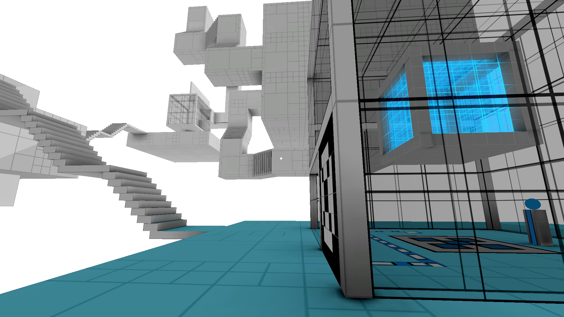
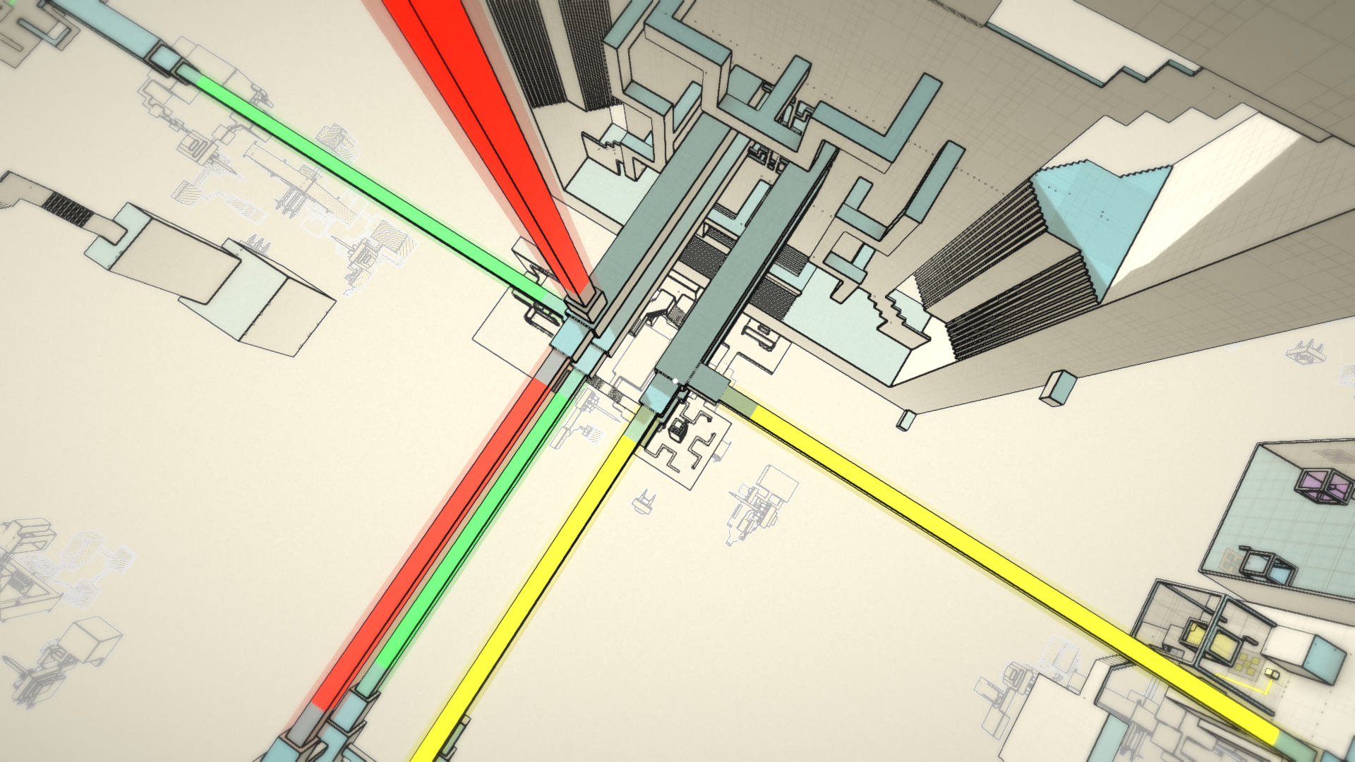
But exterior shots are more different:
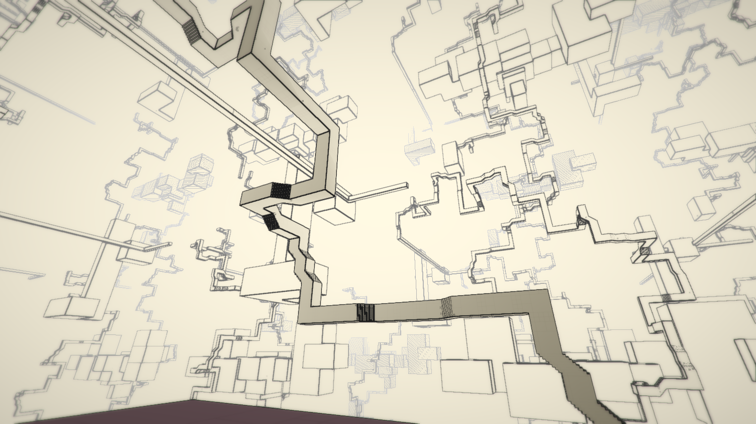
Organized Chaos
In playing around with geometry outdoors, I came across something. For the first several hub worlds, the entire level is one isolated piece (sometimes made up of smaller islands), but the repetitions do not touch each other.
For one level, I wanted a very distinct look, and realized that my making the level large enough, and decreasing the separation space between copies, I could make all the worlds connect, so that the entire level was one infinite connected piece, like this:
which I think looks even more different than Antichamber.
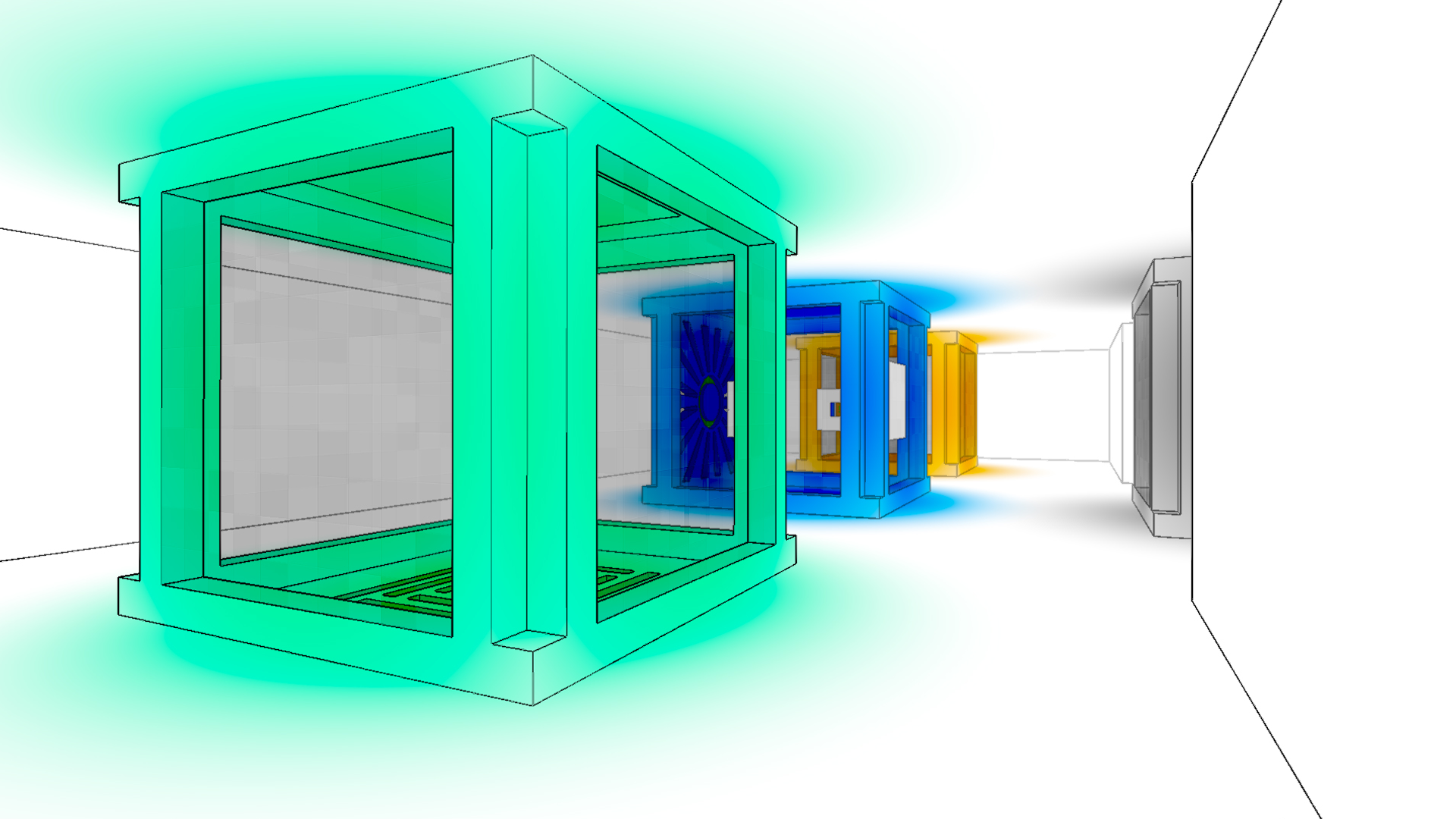
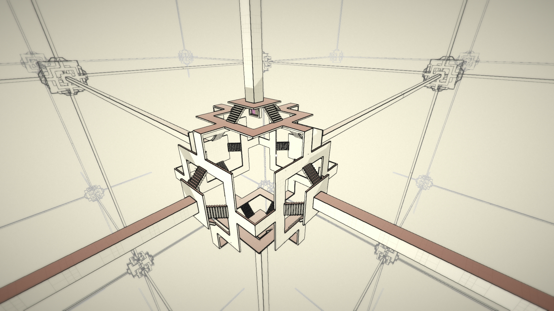
Then Justin Pierce (who’s working on Telos), then showed me this image by Lebbeus Woods:
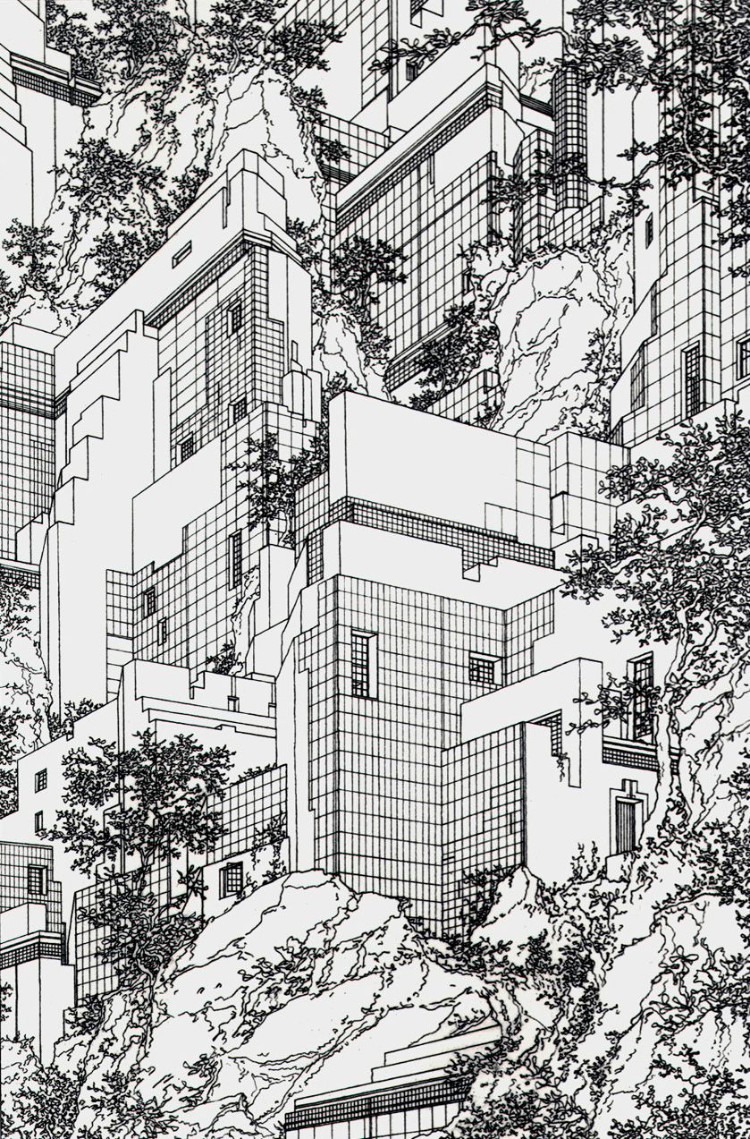
I really liked this image, and thought, if I can incorporate the scale and complexity seen there, then making I can get something very different. What I would need to do, is use the world repetition set up, but allow each world to connect to one another, to create the sense of scale, without letting players get too lost.
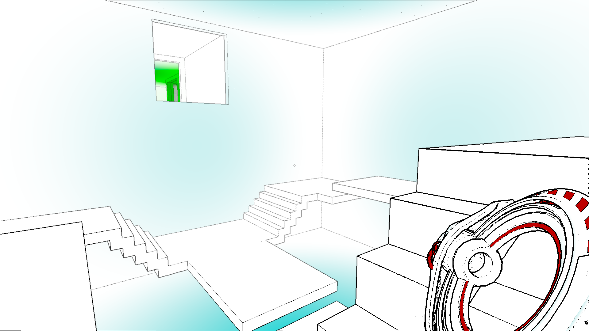
These are from two experimental levels I did up, just to see what it would look like:


I think out of everthing, these are visually the most different from Antichamber. Now, making these levels playable is a different matter. Signposting is going to be tricky, but I think it’s just a design challenge I need to overcome. I think this is a very promising avenue to pursue.
I’d like to call this ‘organized chaos’. The scene at first looks incredibly complex and confusing, but beneath that, there is a structure that would make it easy to navigate and orient oneself.
Also, for these two levels, I placed everything by hand, which I learned very quickly was extremely tedious, so I decided to dive into procedural generation to help me make more of these experiments. However, this post is already way too long, so I will save that for the next update.